Anyone working in environmental science knows that understanding how the environment is faring, and how this has changed over time, is hugely complicated. Everything is interconnected; a change in one part of an ecosystem can have knock-on impacts elsewhere. Defining and measuring what a healthy environment looks like is fraught with difficulty and demands a wealth of data.
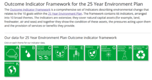
Environmental indicators allow us to track how well government is progressing towards the 25 Year Environment Plan goals. This ambitious strategy deals with unwanted impacts arising from daily life, including pollution, waste production, biodiversity loss, and access to green space. The indicator data are fundamental for guiding action in these areas. For example, the first indicator in the ‘Air’ theme shows changes in five key air pollutants. It is clear from this information that particulate matter levels have been dropping since the 90s, but this improvement has recently plateaued. This evidence helped to inform government action to phase out traditional house coal and wet wood.
In Defra’s Environment Analysis Unit, we have recently launched our new Outcome Indicator Framework dashboard which shares headline results about environmental change in a user-friendly format. We built the dashboard in house by adapting an existing platform for Sustainable Development Goal indicators. This allowed us to save time on development and take advantage of existing features such as accessibility standards.
While more detailed datasets are often available to policy makers via different routes, our dashboard provides easy access to headline messages, charts, data and original source information, and a quick way to cross reference indicators. I have found it a great tool for recalling major findings, summarising pertinent points for a briefing, reusing visualisations, and seeing the big picture across policy areas. Being able to interact with an engaging and responsive site saves time and makes your job that bit easier. Some of the most popular dashboard features are not hugely technical. The ability to hover over a chart and read off the exact value for a year. The ability to click a button to download the entire indicator dataset. My mum even flicked through our indicators so she could tell her friends what I do all day.
I recently read an article about why it took until the 1970s to design something as simple, yet incredibly useful, as a wheeled suitcase. This is often cited as a parable for how we tend to ignore the simplest solutions. There was also an element of making assumptions about what people want; men were seen as the main travellers, and they were too macho to want assistance with carrying their heavy bags. In theory, our core intended audience of well qualified scientists and analysts should have no trouble interpreting environmental information. It is natural to wonder if it is worth the effort to present information to them in a user-friendly website rather than in its original report format. However, we are all people, and a document of well over one hundred pages would have anyone reaching for another cup of coffee and considering how necessary it is to wade through the whole thing. Sometimes the simple wins, like being able to find a result in seconds, can make the difference for getting an important message out to as many people as possible.
We would love to hear your feedback on our dashboard, or hear about similar projects we could learn from via 25YEPindicators@defra.gov.uk


Recent Comments